

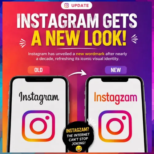
The branding change follows years of consistency around Instagram’s iconic camera symbol, with the latest move focused on typography. The redesign has drawn mixed reactions online, particularly over changes to individual letters.
Instagram has refreshed the typography used in its wordmark, marking the first major change to the text-based part of its branding in nearly a decade. The update gives the “Instagram” lettering a more contemporary appearance while leaving the platform’s familiar camera icon unchanged.
Instagram head Adam Mosseri announced the change on Instagram and Threads, describing the new design as sharper and more modern. The company has retained elements of the original lettering while introducing a more distinctive typeface aimed at giving the brand a refreshed identity.
New lettering changes Instagram’s visual identity
The updated wordmark features noticeable changes in several letters, particularly the “s,” “r” and “g”. Their more prominent curves give the lettering a slightly cursive-inspired appearance compared with the previous design.
The change is limited to the way Instagram’s name is displayed across its branding. The company has not indicated that the update represents a complete overhaul of its visual identity or user interface.
The redesign has generated mixed reactions online. While some users have praised the cleaner and more modern appearance, others have questioned the unusual shape of certain letters. In particular, the redesigned “r” has prompted comments that the brand name can initially look different when viewed quickly.
Familiar Instagram icon remains
Despite the wordmark update, Instagram has retained its existing app icon. The platform continues to use the colourful camera design with its pink, purple and orange gradient, which was introduced in 2016.
That earlier redesign represented a significant shift from Instagram’s original brown camera icon with a rainbow stripe. The gradient camera symbol has since become one of the platform’s most recognisable visual elements and remains unchanged under the latest branding update.
The distinction between the two elements is important. A wordmark refers specifically to a brand name represented through a particular style of lettering, while a logo can include symbols, graphics or other visual elements. In Instagram’s case, the camera icon functions as its primary brand symbol, while “Instagram” serves as the wordmark.
The company has not said whether the refreshed typography will be followed by changes to the app icon, interface or other branding elements. For now, the update remains focused on the written representation of the Instagram name.
The move comes nearly ten years after Instagram’s last major visual refresh. By updating its typography while retaining the familiar camera icon, Instagram is refreshing its brand identity without making a major departure from the visual elements users already recognise.

See What’s Next in Tech With the Fast Forward Newsletter









Tweets From @varindiamag
Nothing to see here - yet
When they Tweet, their Tweets will show up here.