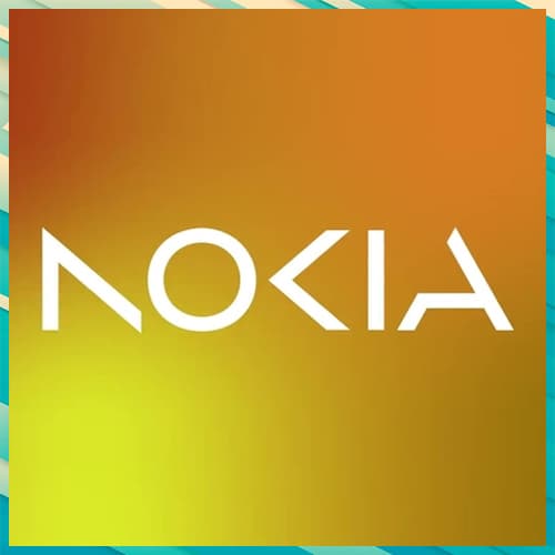
Nokia has announced its plans to change its brand identity for the first time in nearly 60 years. As the telecom equipment maker focuses on aggressive growth, it has come out with a complete new logo. The new logo comprises five different shapes forming the word NOKIA. The iconic blue colour of the old logo has been dropped for a range of colours depending on the use. While Nokia still aims to grow its service provider business, its main focus is now to sell gear to other businesses.
Besides unveiling a new logo, the brand also outlined how it expects networks to evolve in the next seven years or so, and how it is planning to evolve in line with these changes.
“There was an association with smartphones and nowadays we are a business technology company,” Chief Executive Pekka Lundmark said in an interview.
Lundmark further said that Nokia will focus on adding market share in the company's business by serving wireless service providers with network equipment. The company also plans to review the growth path of its different businesses and consider alternatives, including divestment.
See What’s Next in Tech With the Fast Forward Newsletter
Tweets From @varindiamag
Nothing to see here - yet
When they Tweet, their Tweets will show up here.


