Breaking News
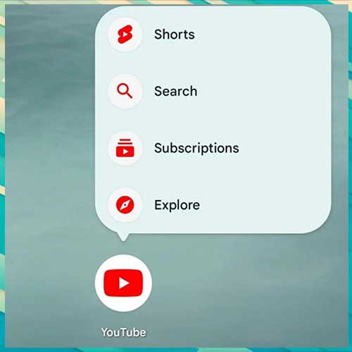
The translucent bar complements other UI elements, such as the rounded corners and gradient backgrounds recently introduced in YouTube’s design updates, creating a more cohesive and polished appearance.
YouTube has begun rolling out a translucent bottom bar for its mobile app on both Android and iOS, marking another step in its ongoing efforts to enhance user experience through design refinements. This subtle yet impactful update aims to modernize the app's interface while maintaining its usability, providing a more immersive viewing experience for users.
The new design replaces the solid-colored navigation bar with a translucent one, allowing the app's background or content to subtly show through. The semi-transparent design gives the app a cleaner, more sophisticated look, aligning with modern UI trends seen in other Google apps and services. By reducing the visual weight of the bottom bar, the design subtly shifts attention to the video content, making the overall experience feel less cluttered.
The translucency adapts to the background colors of the app's interface, creating a cohesive visual experience. Whether you're browsing the Home, Shorts, or Subscriptions tab, the bottom bar blends seamlessly with the app’s overall theme. For users who have enabled dark mode, the translucent bar adds depth without disrupting the minimalist appeal.
Despite the design change, the bottom bar retains its core functionality. Users can still easily navigate between tabs, with icons and labels remaining crisp and easy to identify. The update is being rolled out in phases, so not all users will see the new design immediately. The feature is part of a server-side update, meaning it doesn’t require users to manually update the app via the Play Store or App Store.
Available for both Android and iOS devices it works seamlessly across a wide range of device resolutions and screen sizes. Initial feedback from users who have received the update has been largely positive, with many appreciating the refreshed look and the subtlety of the design change.
As Google continues to innovate, users can expect more design refinements and feature rollouts. By focusing on design consistency, aesthetics, and content prioritization, YouTube is reaffirming its position as a leader in the streaming space. YouTube’s translucent bottom bar is rolling out as a server-side update with version 19.47 (Android) and 19.49 (iOS) today. On the desktop web, the top bar is getting blurred. This change joins other mobile design updates like the miniplayer revamp, reorganized Settings page, and new playback speed controls.
See What’s Next in Tech With the Fast Forward Newsletter
Tweets From @varindiamag
Nothing to see here - yet
When they Tweet, their Tweets will show up here.


